Accordion
<ns-accordion> 
Overview
Accordion enables users to expand and collapse multiple sections of content.
Use ns-accordion to break down content into meaningful sections, helping to reduce information overload. Accordions can be useful for things like frequently asked questions or displaying multiple blocks of related content inside an ns-expander.
Examples
Guidance
Standard
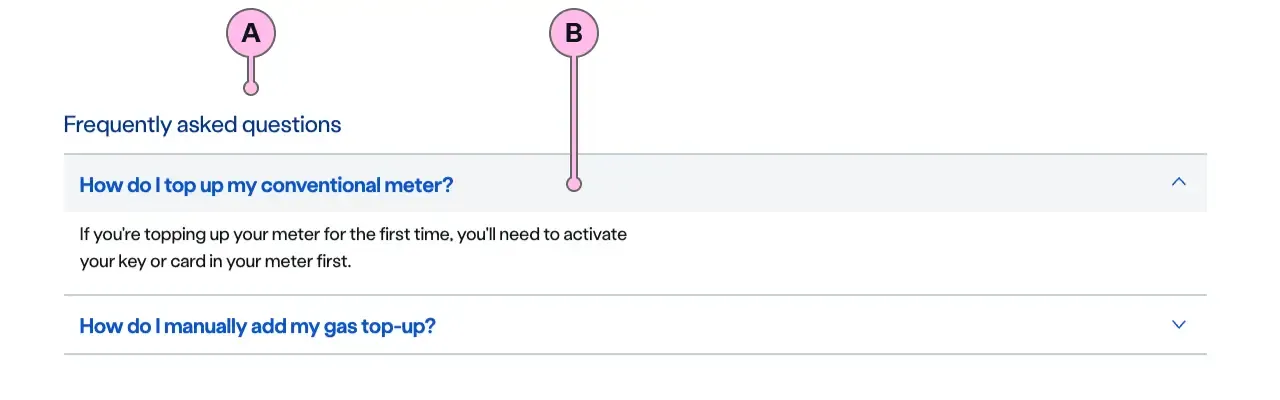
Key
| Key | Field type | Guidelines |
|---|---|---|
| A | Heading | The recommended length is between 4 and 12 words, not exceeding 50 characters in total. |
| B | Content | Use between 1 and 8 <ns-expander> components. All expanders need to be related to the accordion’s heading. |
Considerations
If you need more than 8 ns-expander components, you can use more than one accordion on the page.
If there isn’t a inherent logical order to the expanders, use alphabetical order for ease of scanning.
Implementation
Placement
The ns-accordion component can be used in the following components:
<div>wrapped in<ns-panel><ns-content><ns-editorial>
Specification
Attributes
type
- Property
type- Type
string- Default
standard
Slots
| Slot | Permitted tags | Description |
|---|---|---|
heading | <h2> <h3> | The heading of the accordion. Heading level depends on its place in the semantics of the page. |
| Anonymous slot | <ns-expander> | Anonymous slot for expanders. |
Last updated: