Selector
<ns-selector> 
Overview
Selector is a checkbox or radio form control that has additional information to describe it.
Showcase a product, service or option which users can select. The ns-selector component can function as a single or multiple selection for the user.
Examples
Guidance
Illustration
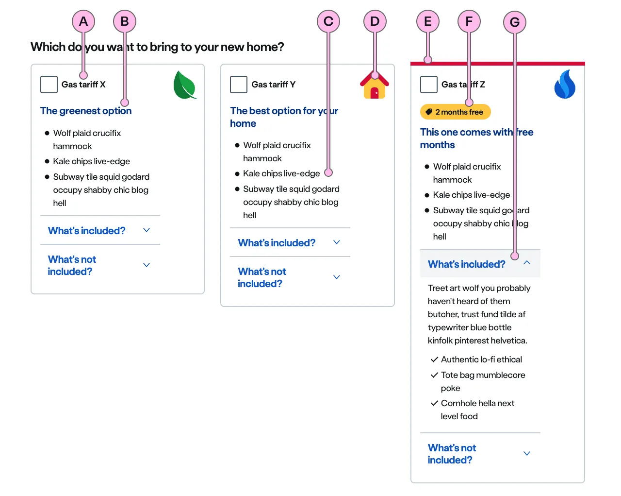
Key
| Key | Field type | Guidelines |
|---|---|---|
| A | Label | The label should describe the selection being made using the most concise content possible. The recommended length is 21 characters maximum. |
| B | Heading | The heading can provide an expanded description of the item being selected. The recommended length is between 3 and 21 characters. This heading should use a light font weight to allow the emphasis on the label. |
| C | Paragraph | The paragraph is mandatory when using with illustration. The illustration should be used purely as decorative in ns-selector and it doesn’t come with an alternative description for assistive technology like screen readers. The paragraph should provide information to make the selector more accessible. The recommended length is 1 concise paragraph or 5 short bullet points, not exceeding 125 characters in total. Can contain bold copy <b>, inline links <a>, lists <ul> <ol>, and a caveat at the end of the relevant paragraph if required <a href="#caveat">1</a>. |
| D | Illustration | Use to support and highlight the content. The illustration should relate to the product or service you are talking about. See our illustrations. |
| E | Keyline | An optional colour keyline can be added to distinguish and draw attention to your selectors. |
| F | Pill | You can use a pill to promote an option that has something special like a discount, a promotion or a because it’s eco-friendly. Use the pill the h3 and the list. Try not to add a pill to each option as it may lose its attention grabbing power. |
| G | Expanders | An optional addition of an ns-expander component within the selector allows for more detail to be discoverable. It consists of a heading and an anonymous content slot. When the heading is clicked the component opens to reveal the content. When in an open state, clicking the heading will hide the content. |
Image
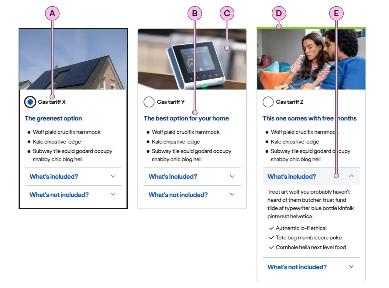
Key
| Key | Field type | Guidelines |
|---|---|---|
| A | Label | The label should describe the selection being made using the most concise content possible. The recommended length is 21 characters maximum. |
| B | Paragraph | The recommended length is 1 concise paragraph or 5 short bullet points, not exceeding 125 characters in total. Can contain bold copy <b>, inline links <a>, lists <ul> <ol>, and a caveat at the end of the relevant paragraph if required <a href="#caveat">1</a>. |
| C | Image | This is the image that will be used above the ns-card. It should have an aspect ratio of 16:9, the dimensions should be 640x360px, the file type should be jpg, and the file size should be no more than 50kb. If this image provides visualisation to the label (Key A), paragraph section (Key B) is optional. |
| D | Keyline | An optional colour keyline can be added to distinguish and draw attention to your selectors. |
| E | Expanders | An optional addition of an ns-expander component within the selector allows for more detail to be discoverable. It consists of a heading and an anonymous content slot. When the heading is clicked the component opens to reveal the content. When in an open state, clicking the heading will hide the content. |
Implementation
Placement
The ns-selector component can be used in the following components:
Specification
Attributes
decoration
- Property
decoration- Description
- The name of the illustration to display on the selector.
- Type
string- Options
- Refer to our illustrations.
image
- Property
image- Description
- The URL of the image to display on the selector.
- Type
string
keyline
- Property
keyline- Description
- The keyline of the selector.
- Type
string- Options
cyanlimenavyblueforestslateorangeredyellow- Default
type
- Property
type- Type
string- Default
standard
Slots
| Slot | Permitted tags | Description |
|---|---|---|
description | <div> | The description of the selector. Mandatory when using with `decoration` attribute and optional when using with `image` attribute |
| Anonymous slot | <input> <label> | Anonymous form elements such as input and label. |
Last updated: