Assets
guidelines Icons
Icons are used within our design system to represent an object or action visually to our users.
Decorative
Used as a visual aid for some functions, categories or actions. These are not used as a direct element of interaction themselves but can help to signify and support an action. It is recommended that these aren’t used in isolation and should be accompanied by copy to add context.
There are two types of Decorative icons to choose from – solid or outline (the default is solid). Be mindful to maintain the consistency when using in groups.
Functional
Used to show where an action needs to be taken. This includes components like buttons or controls. For instance a button might include an arrow to give the user an indication of what will happen next or a download icon to show that the user will receive something by pressing it.
plus minus cross arrow chevron chevron-down download tick hide hive settings loading log-out menu search show switch alert alert-solid alert-off alert-off-solid appliance appliance-solid bar-chart bar-chart-solid bill bill-solid boiler boiler-solid calendar calendar-solid clock clock-solid dual-fuel dual-fuel-solid electricity electricity-solid energy energy-solid error error-solid gauge gauge-solid gas gas-solid home home-solid info info-solid location location-solid meter meter-solid payment payment-solid piggy-bank piggy-bank-solid protect protect-solid question question-solid rewards rewards-solid spanner spanner-solid success success-solid tag tag-solid tariff tariff-solid user user-solid warning warning-solid chevron-right arrow-right arrow-left chevron-left chevron-up alert-outline alert-off-outline appliance-outline bar-chart-outline bill-outline boiler-outline calendar-outline clock-outline dual-fuel-outline electricity-outline energy-outline error-outline gauge-outline gas-outline home-outline info-outline location-outline meter-outline payment-outline piggy-bank-outline protect-outline question-outline rewards-outline spanner-outline success-outline tag-outline tariff-outline user-outline warning-outline Illustrations
We use illustrations to bring warmth of the British Gas brand personality to the website.
appliance appliance-cover appliance-repair air-source-heat-pump bar-graph battery boiler boiler-cover boiler-repair boiler-service bulb calendar calendar-selected-date central-heating chat chat-round-clock checklist circle-tick-blue clock compass cosmo dishwasher document document-in-envelope dual-fuel electrics electric-charger electric-charging-station electric-vehicle engineer-long-hair engineer-short-hair engineer error fix fixed-s-a fixed-sa fridge-freezer gas gas-fire green-leaf help hob home home-solar-panel-green home-insurance home-service laptop low-carbon meter multiple-people oven payments payment-card phone pipe-and-drain protect radiator rosette-tick-green savings savings-calculator settings sms socket-plug solar-panel tap track-engineer van warning water-drips whats-app yellow-shield Images
Aspect ratios
There are three aspect ratios used, 1:1, 4:3 and 16:9, which we use in various ways. Take a considered approach and do not overload with too many variants.
Responsive rules
For all of the aspect ratios, there is a rule that all images scale proportionally to their ratio. This means that they will retain their shape from large screens to small ones.
The aspect ratios always scale proportionally. If it is a full-width image the highest width should be 1440px.
Placeholders
| Placeholder | Aspect ratio | Dimension | Size |
|---|---|---|---|
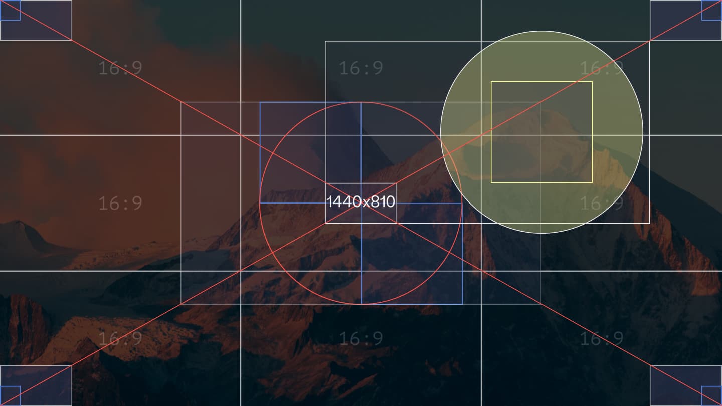 | 16 / 9 | 1440 x 810px | < 200kB |
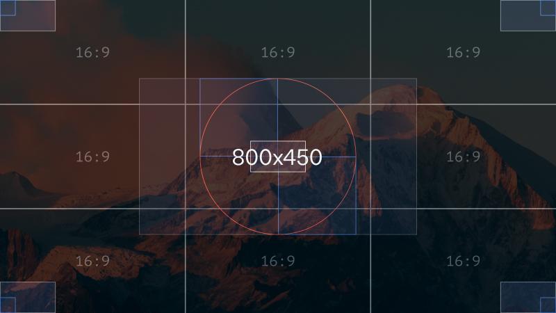 | 16 / 9 | 800x450px | < 100kB |
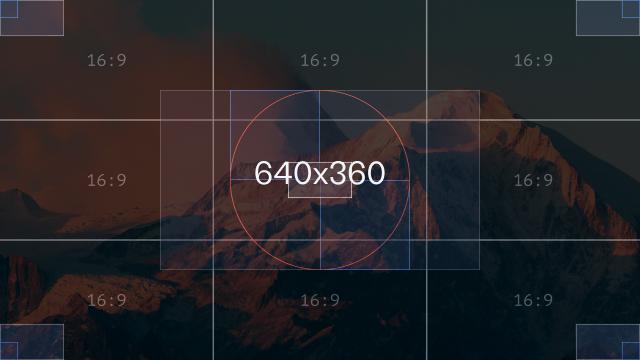 | 16 / 9 | 640x360px | < 50kB |
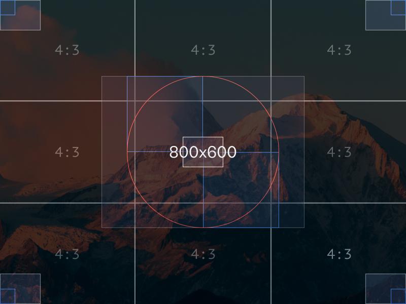 | 4 / 3 | 800x600px | < 100kB |
 | 4 / 3 | 480x360px | < 50kB |
 | 1 / 1 | 800x800px | < 100kB |
Last updated: