Alert
<ns-alert> 
Overview
Alert can be used to communicate error, info, success and warning messages in an accessible and visual way.
Examples
type="highlighter"
state="error"
For communicating failure with urgence. A task cannot be completed without the user remedying something.
state="info"
For communicating a useful piece of information that the user might find helpful to carry out their action.
state="success"
For communicating that an action has been successful.
state="warning"
Use for communicating a piece of information with less severity. These include foreseeable problematic events, failures, outages and how to avoid errors.
Guidance
Highlighter
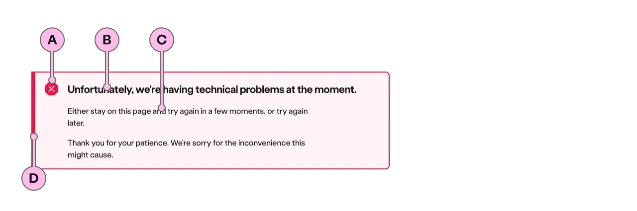
Key
| Key | Field type | Guidelines |
|---|---|---|
| A | Icon | This is the icon for the highlighter type. It is dictated by the state of ns-alert. The specification has a list of options. |
| B | Heading | The recommended length is between 4 and 12 words, not exceeding 50 characters in total. |
| C | Content | A single, short paragraph works best. The copy length should not exceed more than two paragraphs of 3 lines each. Include bold copy <b>, inline links <a>, and a caveat at the end of the relevant paragraph if required <a href="#caveat">1</a>. |
| D | Accent | This is to support the context of the messaging. This colour matches that of the icon. |
Considerations
- Be clear and concise
The message must be in plain English, and help the user out of the situation by providing an actionable link if possible.
Implementation
Placement
The ns-alert component can be used in the following components:
<div>wrapped in<ns-panel><ns-form>
Specification
Attributes
dismissible
- Property
dismissible- Type
boolean
state
- Property
state- Description
- The state defines the role of the alert.
- Type
string- Options
errorinfosuccesswarning- Default
error
type
- Property
type- Description
- The type of alert to use.
- Type
string- Options
standardhighlighter- Default
standard
Slots
| Slot | Permitted tags | Description |
|---|---|---|
heading | <h2> <h3> | The heading of the alert. |
| Anonymous slot | <p> <div> | Anonymous slot for content. |
Events
| Name | Description |
|---|---|
close-alert | Dispatched when the alert is closed. |
Accessibility
The information contained in the alert should always be the most important information on the page. To ensure that screen reader users are informed about the importance of these messages the content is read aloud as soon as the alert type is used. This could be when the page loads or when it is dynamically added to a page.
If there are multiple alerts on a page they are read:
- from top to bottom on page load
- in the order they have been added to the page when dynamically added
Last updated: