Cta
<ns-cta> 
Overview
A call-to-action allows users to take action once they are ready for it.
Users can perform particular actions through the use of the ns-cta component. An example of these actions could be to submit a form through an event (i.e. a click event) or navigate with a hyperlink.
There is no distinction between a hyperlink or an action through the design of the ns-cta component. Use its textual content to convey the intent of the CTA to the user.
Examples
Guidance
Standard
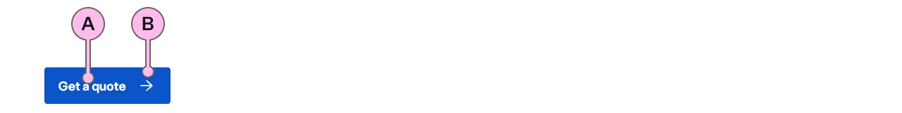
Key
| Key | Field type | Guidelines |
|---|---|---|
| A | Text | Keep the text ‘short, relevant, and actionable’. It should not exceed more than 24 characters. |
| B | Icon | This is a decoration. It is intended to imply direction such as moving forwards and backwards in a journey. The specification has a list of options. |
Implementation
Placement
The ns-cta component can be used in the following components:
Specification
Attributes
href
- Property
href- Type
string
loading
- Property
loading- Description
- Whether the CTA is in a loading state.
- Type
boolean- Default
false
loading-message
- Property
loadingMessage- Description
- The message to display when the CTA is in a loading state. Defaults to 'Loading...'.
- Type
string- Default
Loading...
disabled
- Property
disabled- Type
- Default
false
icon
- Property
icon- Type
string- Options
- Refer to our icons.
- Default
arrow-right
type
- Property
type- Description
- The type of the CTA.
- Type
string- Options
directtextsubmitreset- Default
direct
Slots
| Slot | Permitted tags | Description |
|---|---|---|
| Anonymous slot | Anonymous slot for content. |
Events
| Name | Description |
|---|---|
click | Dispatched when the CTA is clicked. |
Specification notes
Icons
They are decorative, not descriptive, and are there to supplement the text.
href
- Can be used instead of having a wrapping
<a>element. - This shouldn’t be used if a
clickevent is added.
Last updated: