Appointment picker
<ns-appointment-picker> 
Overview
Appointment picker is used to select a date and time slot for an appointment.
The appointment-picker comprises a calendar to select a date and a radio-button type inputter to show the available time slots for the selected date.
Examples
Guidance
Standard
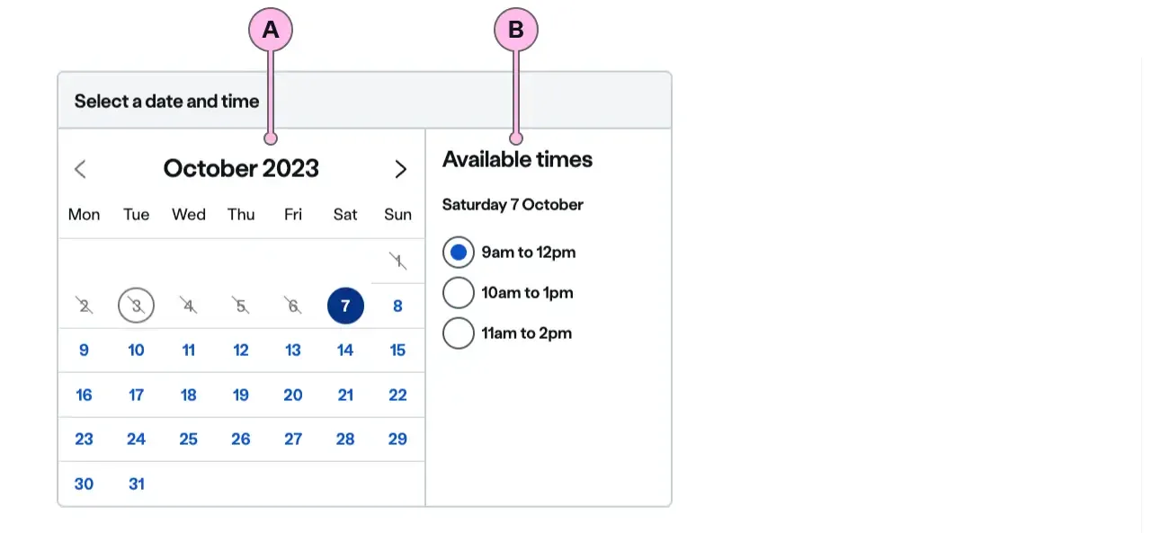
Key
| Key | Field type | Guidelines |
|---|---|---|
| A | ns-calendar | The calendar to select the date. |
| B | ns-inputter | The picker to select the time. |
Implementation
Placement
The ns-appointment-picker component can be used in the following components:
Specification
Attributes
slot-data
- Property
slotData- Description
- An array of time slots available for an appointment.
- Type
object- Default
[]
validation
- Property
validation- Type
string[]- Default
[isRequired]
disableNative
- Property
disableNative- Type
boolean- Default
true
showMessage
- Property
showMessage- Type
boolean- Default
true
name
- Property
name- Description
- The form name of the appointment picker.
- Type
string
value
- Property
value- Description
- The value of the selected appointment.
- Type
string- Default
labelID
- Property
labelID- Type
string- Default
heading
- Property
heading- Type
string- Default
type
- Property
type- Type
string- Default
standard
Events
| Name | Description |
|---|---|
change | Dispatched when a specific time slot is selected. It holds the value of the appointment picked. |
slot-data
The slot-data attribute (slotData property) should consist of array of objects containing a date and a slots property.
date: String - eg. 2020-01-28 (28th January 2020). slots: Array of objects with a name and value pair.
const slots = [  {    name: "9am to 12pm",    value: "0900-1200",  },  {    name: "10am to 2pm",    value: "1000-1400",  },  {    name: "12am to 5pm",    value: "1200-1700",  },];
const slotData = [  { date: "2020-01-28", slots: slots },  { date: "2020-01-29", slots: slots },];
Last updated: