Tabs
<ns-tabs> 
Overview
Tabs provide organisation of content separated within the same context.
The ns-tabs component separates related content into clearly labelled sections. It comprises multiple ns-tab components.
Examples
Guidance
Standard
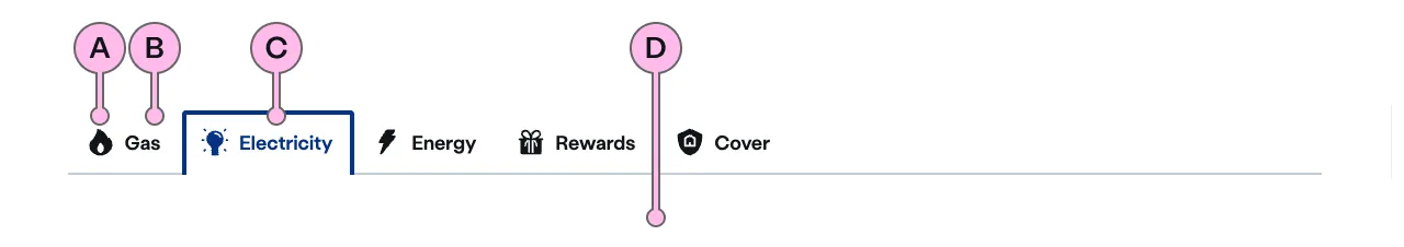
Key
| Key | Field type | Guidelines |
|---|---|---|
| A | Icon | This is the icon inside the tab. This should relate to the label text. See our icons. |
| B | Heading | Use 1 or 2 words to inform the user of information found within each panel below. |
| C | Selected Tab | This is the visual state of a selected tab. Used to show the user which content is visible below. |
| D | Panel | This is the area in which the content for each <ns-tab> will be displayed. |
Implementation
Placement
The ns-tabs component can only be used as a child of the <main> element.
Specification
Attributes
open
- Property
open- Description
- The index of the tab to open.
- Type
number- Default
0
type
- Property
type- Type
string- Default
standard
Slots
| Slot | Permitted tags | Description |
|---|---|---|
tab | <ns-tab> | The tab to be displayed. Slot tab is shown in the order they are added |
panel | <ns-panel> | The content of the tab. Slot panel are in the same order as slot tab. |
Events
| Name | Description |
|---|---|
tabchange | The event fired when the tab is changed. |
Specification notes
Tab
Multiple tab slots should be added to add multiple tabs. There should be the same amount of tab slots as panel slots.
Panel
Multiple panel slots should be added to add multiple panels. There should be the same amount of panel slots as tab slots.
Last updated: